Basically histograms don't show anything you can't see in the image itself if you know where to look and look really closely. But histograms have the advantage that they are more structured than the image itself, so they let you recognize image problems easier.
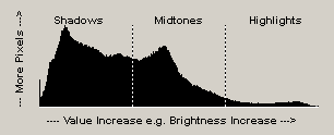
A histogram is a statistical display of an image parameter, e.g. brightness, hues or saturation. It shows the distribution of certain pixel values in an image. These values usually range from 0 to 255 in a 8bit image. The range of these values is displayed from left to right in the histogram, so the value 0 is displayed at the outer left and the value 255 is displayed on the outer right side. The amount of each value is displayed from bottom to top, so the height of the curve represents the number of pixels that have a certain value. If more pixels have a certain value, the histogram curve will be higher at that point.
In ColorWasher the histogram curve is separate into three areas: the shadows on the left side (with values from 0 to 85), the midtones in the middle (with values from 86 to 170) and the highlights at the right side (with values from 171 to 255). ColorWasher displays all three areas equally wide, although some people may argue that the midtones are double as wide as the shadows and the highlights. But usually it more useful to define the three areas equally wide.
Peak, Mean, Shadows, Midtones and Highlights labels
![]()
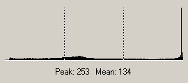
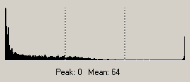
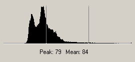
The Peak figure lets you know which brightness, color or other value occurs most often in the image. The histogram curve usually has its peak at that value. The Mean figure tells you the average brightness, color or other value. If this value is below 128, the image contains e.g. more dark then bright areas.
The Shadows percentage lets you know how much of the image is in the lower value range (e.g. is quite dark), the Midtones figure tells you how much of the image is in the middle range (e.g. is moderately bright) and the Highlights percentage shows you how much of the image is in the upper range (e.g. is bright). For example if the Shadows percentage in the RGB or Intensity histogram is very high, it can mean that the photo is underexposed.
RGB Histogram
You can use the RGB histogram to see if there are blown highlights or cutoff shadows in an image. Blown highlights can be identified by a high spike at the right side whereas cutoff shadows are represented by a high spike at the left side. The higher and wider the spike is, the more information was cut off.
If there is large slope on the left or right side and not just a thin spike, then the photos is already quite damaged. Another bad sign is if the middle part of the curve is quite flat or extremely ducked to the ground. If such histograms are produced by a correction you did in ColorWasher, you should correct your adjustment.
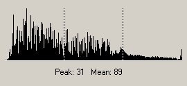
The RGB histogram also shows the darkest value (the end point of the curve at the left) and brightest value (the end point of the curve at the right) in an image. Both are also called black point and white point. The range between both points is called dynamic or tonal range and determines the contrast of the image. The optimal contrast is achieved if the curve starts at the outer left and ends at the outer right. If that isn't the case, the image may not have a good contrast. If the curve starts too more towards the middle, it also means that the image is too bright. If it ends more in the middle, then the image is too dark.
Nevertheless there are always exception from the rule. A photo with a snow landscape will produce a similar histogram as an overexposed photo, but the snow photo is fine while the overexposed photo needs to be fixed. On the other hand a photo with a black sky and stars or the moon looks on the histogram as if it is underexposed, although that isn't the case. So a good rule is to always investigate the image, too, and to not trust the histogram completely.
Small gaps tend do show up in the RGB Histogram
more often than in other histogram types. They are only a sign that an image
was processed and are usually nothing to worry about. For more information please
see the Histo Fix check box.
Intensity, Luminosity and Lightness Histograms
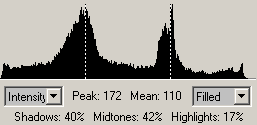
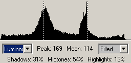
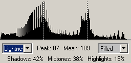
The Intensity, Luminosity and Lightness histograms are very similar for many images. They often let you better judge the brightness distribution in an image, but they are not suitable to judge blown highlights or cutoff shadows. If the image contains more shadows, the hill is more on the left side. If it contains more highlights, the hill is located on the right side. If it is well balanced, the hill or hills are usually in the middle of the histogram.
If there are two hills, one on the outer left side in the shadows and one on the outer right side in the highlights, it means that the photo was taken under extreme light conditions and contains too dark as well as too bright areas.
If these hills have its peaks at the outer left and right side, the image has a too extreme contrast. In such a case you should choose "Balance Midtones" from the Exposure Fix combo box or fine tune the image by using the Highlights and Shadows sliders to compensate for it.
Red, Green, Blue, Cyan, Magenta and Yellow
Histograms
These histograms can be used to recognize color casts or other color problems.
For example if the Blue Histogram contains a curve that is only located in the
shadows, it means that there are as good as no light blue areas in the image.
This can mean that the color blue was suppressed in the image and that the image
has a yellow color cast.
Hue
Histogram
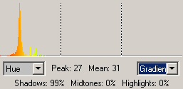
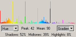
The Hue histogram lets you see if some hues are missing.
If some hues are dominant in the image, it can mean - but not necessarily -
that there is a color cast. A close-up photo for example is usually missing
some hues even if it doesn't have a color cast.
Saturation Histogram
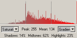
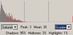
The Saturation histograms lets you see if there is a problem with the saturation in the image. For example if there is nothing in the left part, the image may be oversaturated or if there is nothing on the right side, the image is probably undersaturated. However, images with a lot of white and dark areas may appear undesaturated according to the histogram, but as pure white and black have no saturation, that may not be true.
In such a case you can try the Saturation feature from
the Extras tab sheet.
Colors Histogram
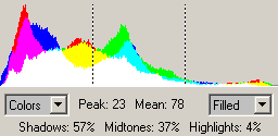
The Colors histogram is similar to the RGB histogram, so it also lets you see if there are blown or cutoff areas. Additionally it shows which hues are dominant in the shadows, midtones and highlights.
Black and White Histograms
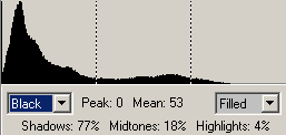
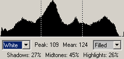
The left part of Black histogram and the right part of the White histograms are similar to the RGB histogram. Both histograms should fill the whole value range from left to right for a good correction. The above Black histogram indicates that the image is too "black" and too much "white" at the right end of the histogram is missing. The above White histogram also has a larger gap at right end, which means that the white values aren't fully used.
If there is a large gap at the right or left end of the histogram, it means hat the contrast of the image is bad. Spikes at the outer left or right indicate cut-off shadows and blown highlights.
Styles
ColorWasher lets you display the histograms in four different styles. "Filled" created the standard histogram type that is known from many graphics applications. The "Gradient" option draws a color gradient from left to right. The colors of this gradient are different from histogram to histogram. The "Line" option draws a line and leaves the area underneath empty. "Dot" plots the histogram values as dots, which may make some histogram values less readable, but lets you easier recognize a general trend.